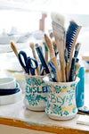
A carafe can become a familiar presence at the table. It is filled before dinner, passed between friends, and left within reach during a long conversation. Its shape becomes part of the background of those occasions, until the object feels inseparable from the way you like to gather.
Rosendahl Grand Cru has grown through that kind of familiarity. The collection is recognized for clear forms and characteristic grooves, carried across objects for serving, drinking, and eating. Its story begins with something considerably smaller than a dinner service: a wine stopper, and the possibility that one useful design could establish an entire visual language.


Grand Cru tableware
A Wine Stopper with a Bigger Future
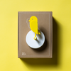
Grand Cru began in 1993 with a wine stopper by Danish designer Erik Bagger. It was Rosendahl’s first own-brand product, created for the business Erik Rosendahl had founded in 1984. Steel and rubber gave the compact tool a combination of precise structure and practical purpose.
Bagger’s background helps explain the attention to materials. Trained as a goldsmith, he worked at Georg Jensen before establishing his independent design practice in 1987. His experience joined the close observation of small objects with an interest in industrial production and combinations of different materials.

A wine stopper is a revealing starting point for a designer with that background. Its dimensions are intimate. It is held, inserted, removed, and set down; its function depends on a connection between separate parts. The design has to make sense through touch and movement as well as through its appearance.
The stopper also offered Rosendahl a recognizable idea around which to develop further products. Grand Cru grew from a particular object and its design decisions, rather than arriving as a fully furnished table. That gradual development remains part of the collection’s appeal: each addition belongs to a larger family, while answering a task of its own.

Grand Cru wine tools, including the stopper
The Carafe and the Clarity of Four Grooves
The Grand Cru carafe became an important expression of that expanding identity. Its four grooves establish a recognizable rhythm around the glass, turning a simple vessel into something with a clear visual signature. The detail is easy to recognize without overwhelming the outline of the object.
Those grooves create a relationship between structure and surface. Viewed from one angle, the carafe reads as a clean volume. As it turns, light catches the recessed lines and the glass acquires more depth. Water, reflections, and the objects behind it become part of the changing appearance.

A retrospective in the Danish design trade publication Designbase describes the carafe’s early production at a bottle factory. That choice connects the collection to industrial manufacturing and the ambition to make useful design broadly available. The method of producing an object was part of the opportunity, alongside its shape.
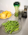
The carafe also illustrates why transparent materials reward restraint. A strongly patterned surface can compete with everything visible through it. Grand Cru’s limited geometric vocabulary allows the contents and the setting to remain part of the composition. A white tablecloth, a dark tabletop, or a brightly colored glass beside it can each produce a different impression.

The table provides the common setting for these variations. A meal brings different materials into close contact, making the relationship between glass, porcelain, textiles, and food part of the experience.

The Grand Cru collection
From a Single Tool to the Whole Table
Grand Cru’s growth took place over years. Designbase’s anniversary account records the addition of porcelain tableware in 2005 and glass oven dishes in 2009. The collection moved into more stages of preparing and sharing food while retaining a recognizable connection between its pieces.

That development changed how someone could use the collection. A wine accessory answers a specific task; a broader group of plates, glasses, bowls, and serving pieces can accompany the whole meal. The design language becomes something experienced across a sequence of actions rather than in one isolated moment.
Repetition is particularly useful on a table. Several objects must share a limited surface, often alongside food, flowers, cutlery, and linens. A recurring detail can create order among those different shapes. It gives the eye a connection to follow while leaving the meal itself at the center of attention.


The effect does not depend on assembling every piece. One person might begin with a carafe and tumblers, another with plates. A serving bowl can join tableware that has been collected over many years. The family resemblance makes coordinated combinations possible, while the individual forms remain straightforward enough to stand on their own.

This is part of what makes a long-running collection interesting. Its history is experienced differently by each household. A piece bought for a first apartment may later appear on a larger dining table, or become the object a family reaches for during a particular celebration. The collection’s continuity leaves room for those personal associations to accumulate.

Grand Cru’s evolving glassware
A Familiar Language with Room to Evolve
The contemporary Grand Cru family includes interpretations such as Grand Cru Nouveau and selected pieces made from recycled glass. These developments extend the collection’s material and visual possibilities. Specific materials and finishes vary by product, giving each version its own place within the wider story.
Nouveau brings color and a different expression of the grooved surface into the collection. In a carafe and glasses, the repeated lines interact with the tone of the glass, adding another layer to the way the objects catch light. The result offers a more expressive route into a familiar design vocabulary.


For a home, these variations open up several approaches to the table. Clear glass can keep the setting visually light. Colored pieces can introduce a focal point or echo a textile, flower, or ceramic already in the room. A coordinated set can create calm; a smaller grouping can supply an accent among things you already own.
The most useful question is often how you will enjoy using the pieces. A carafe placed within easy reach may become part of a workday. Glasses reserved for visitors might gradually become everyday favorites. The design gains meaning as it moves from the photograph into the habits of a household.
Grand Cru is a collection within Rosendahl, and its story reflects the brand’s broader interest in practical, approachable design. What gives it a distinct identity is the continuity between the original small tool, the familiar carafe, and the tableware that followed. A few clear ideas have provided enough character to support decades of development.
At BrandsWalk, we appreciate objects that offer both a story and a natural place in the home. Grand Cru does that through recognizable details and familiar uses. Its history begins with a stopper, but its continuing story happens around the table: in the water poured, the plates passed, and the time people choose to spend together.

Grand Cru at the table